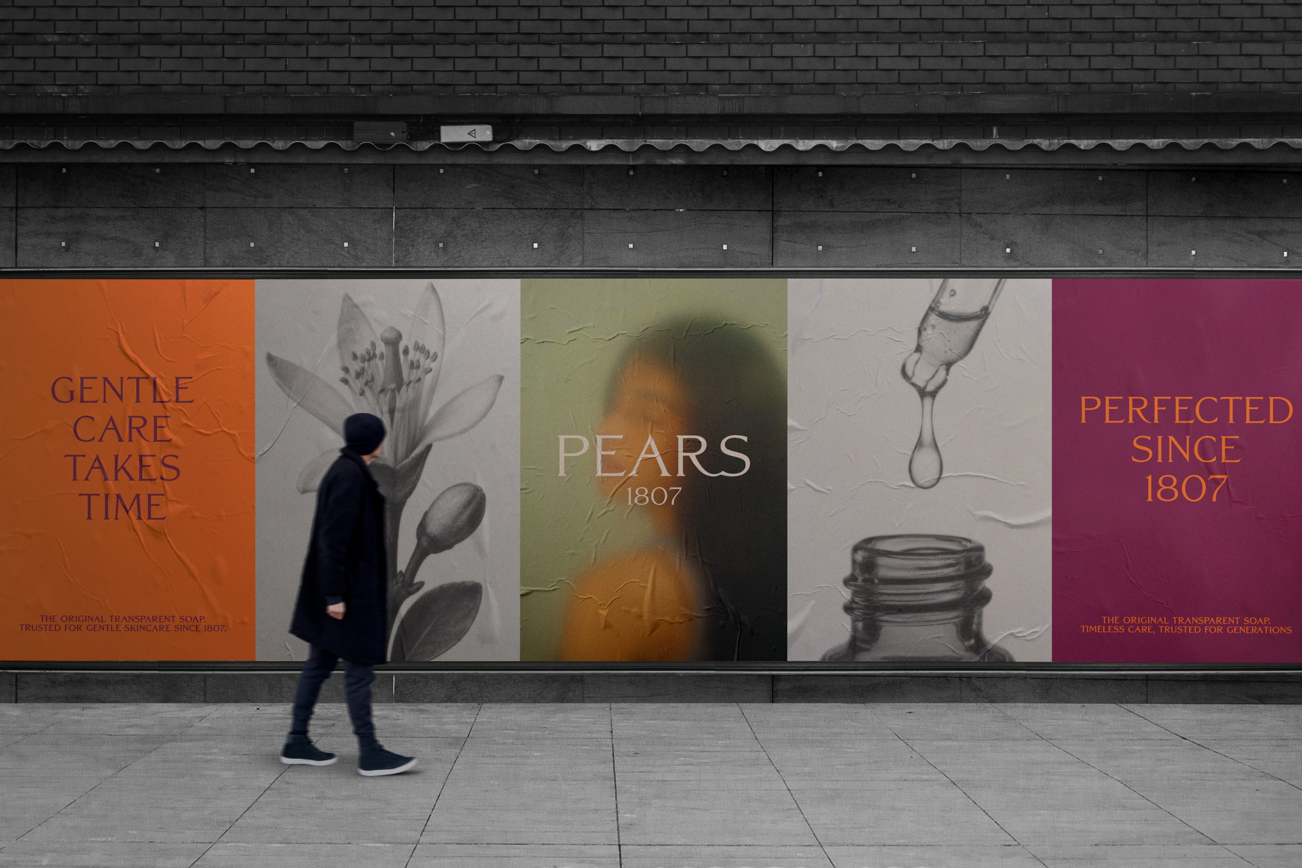
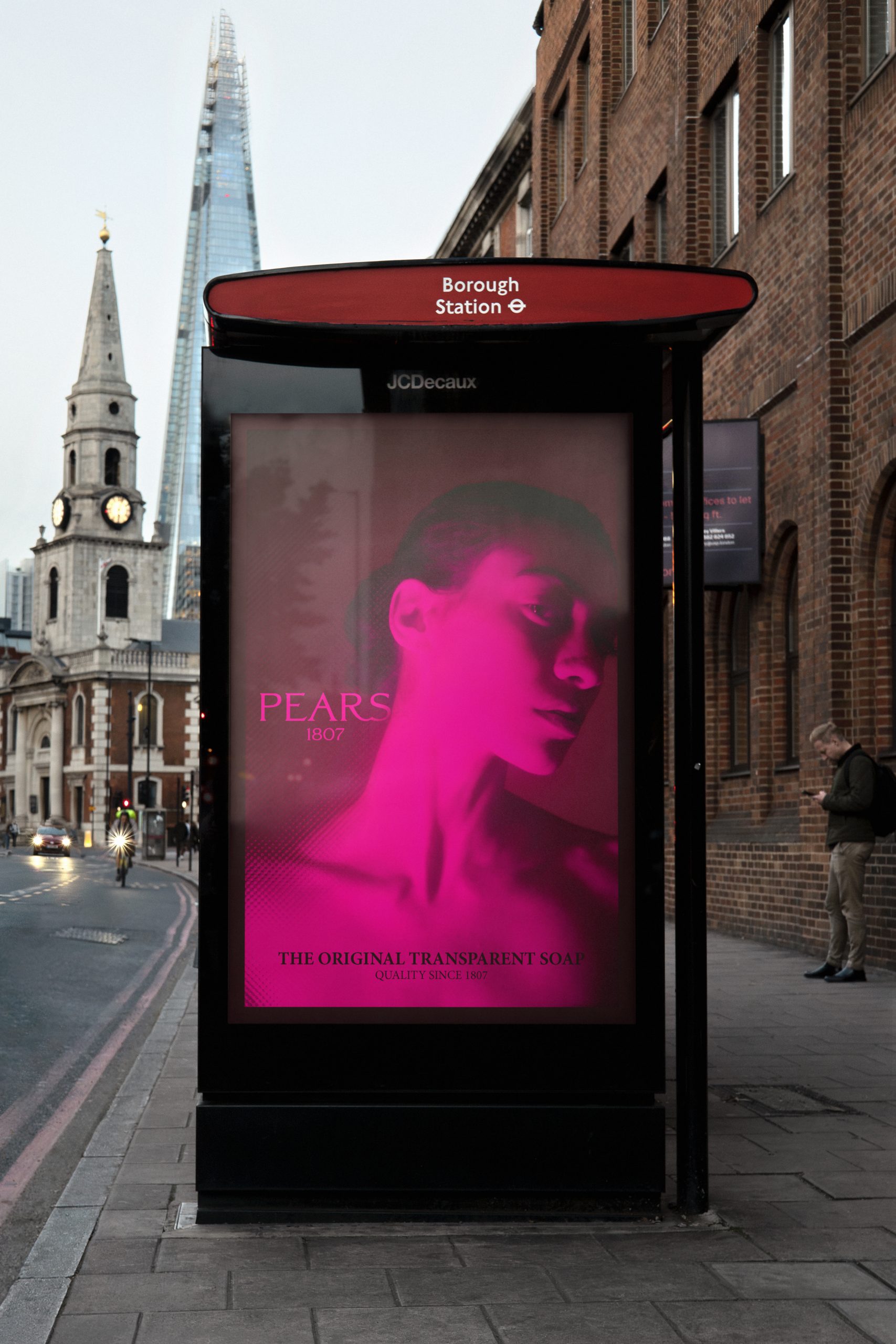
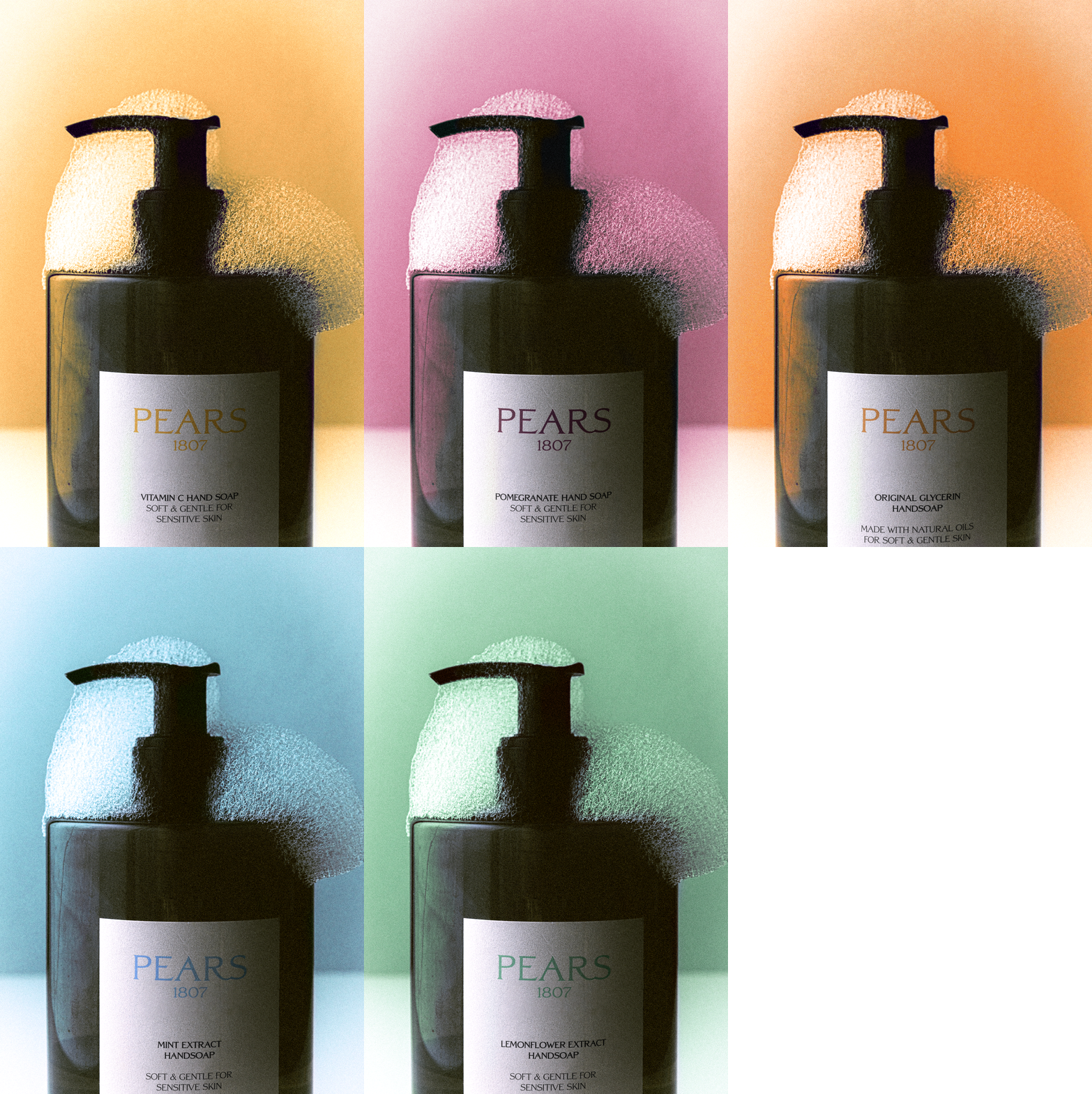
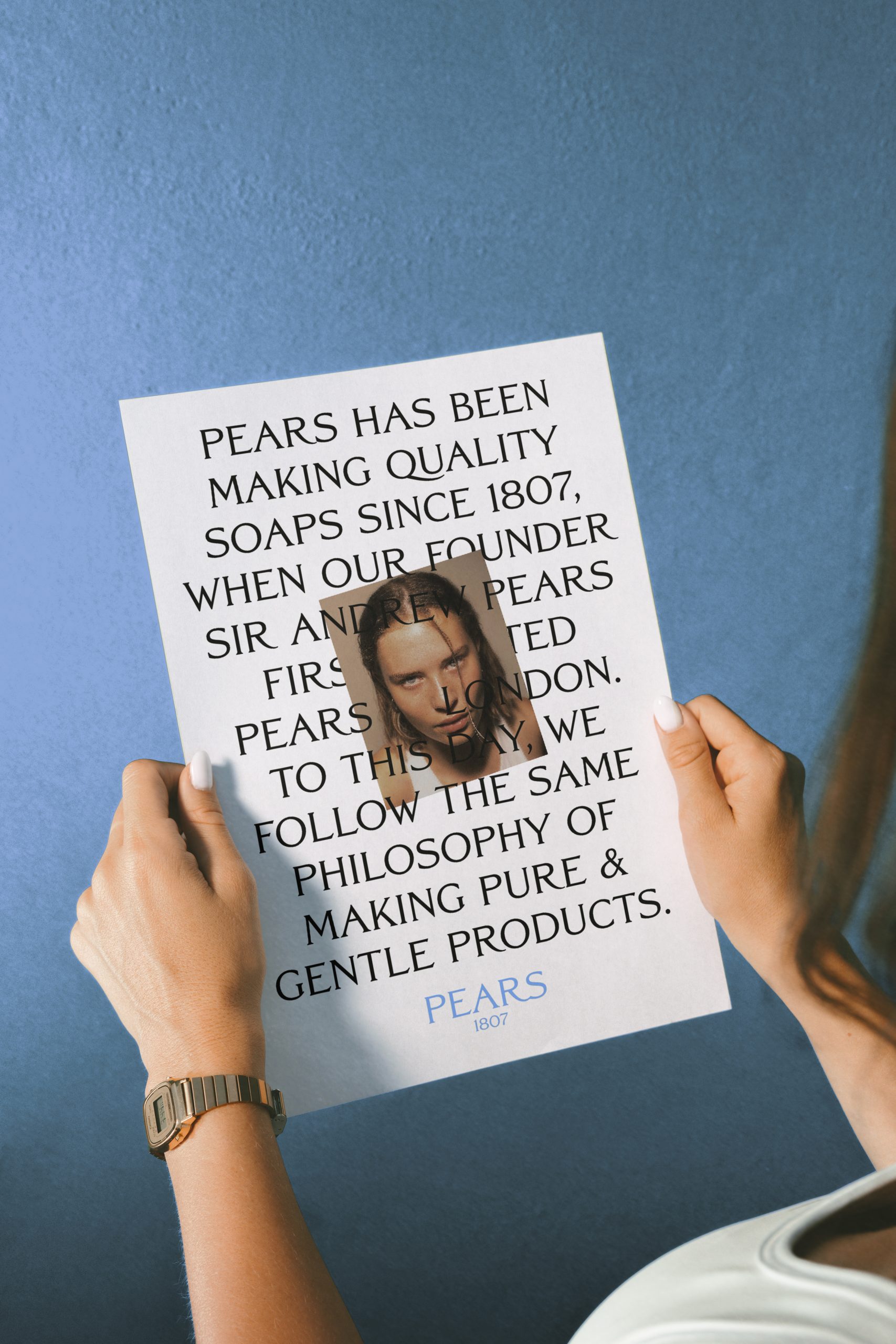
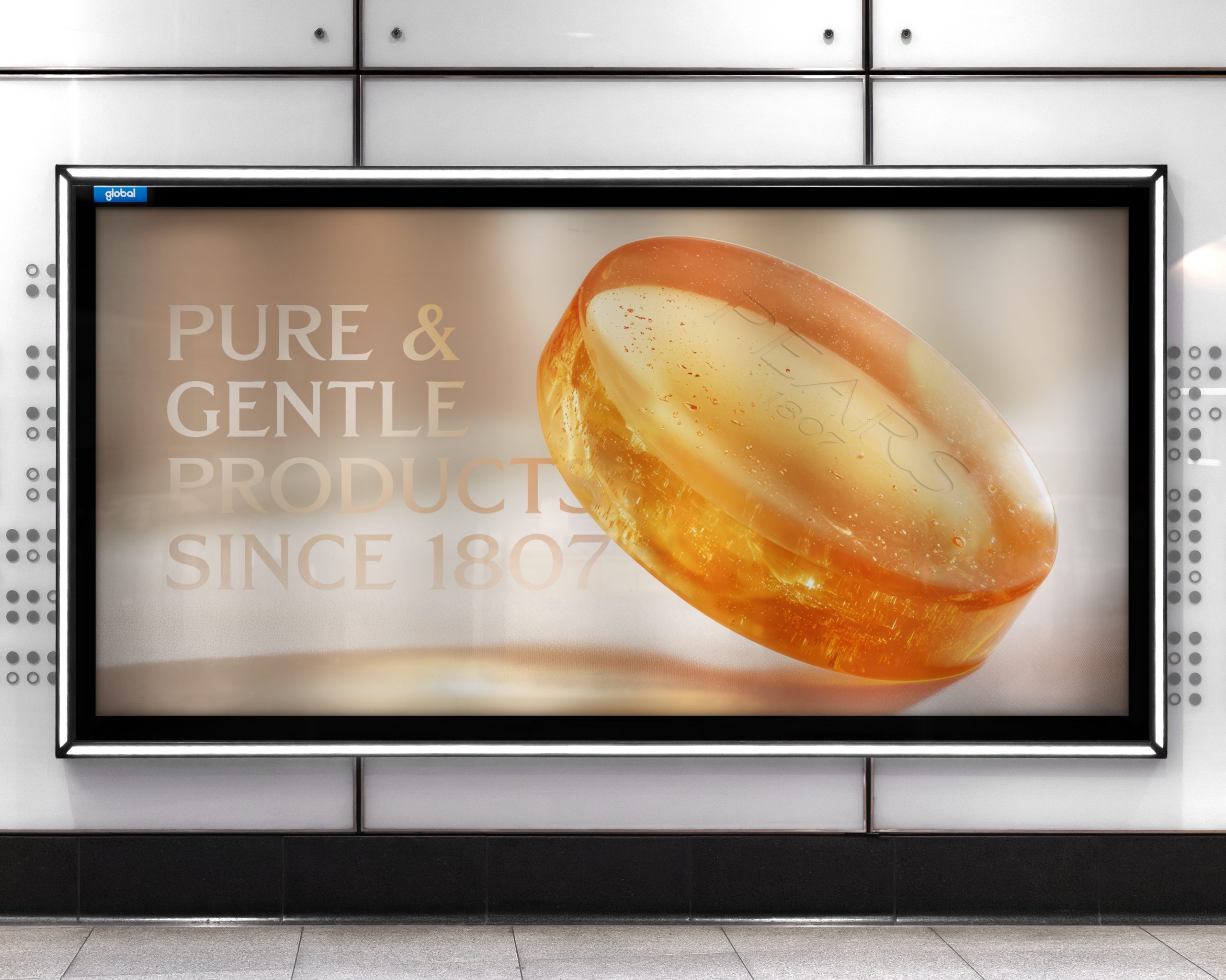
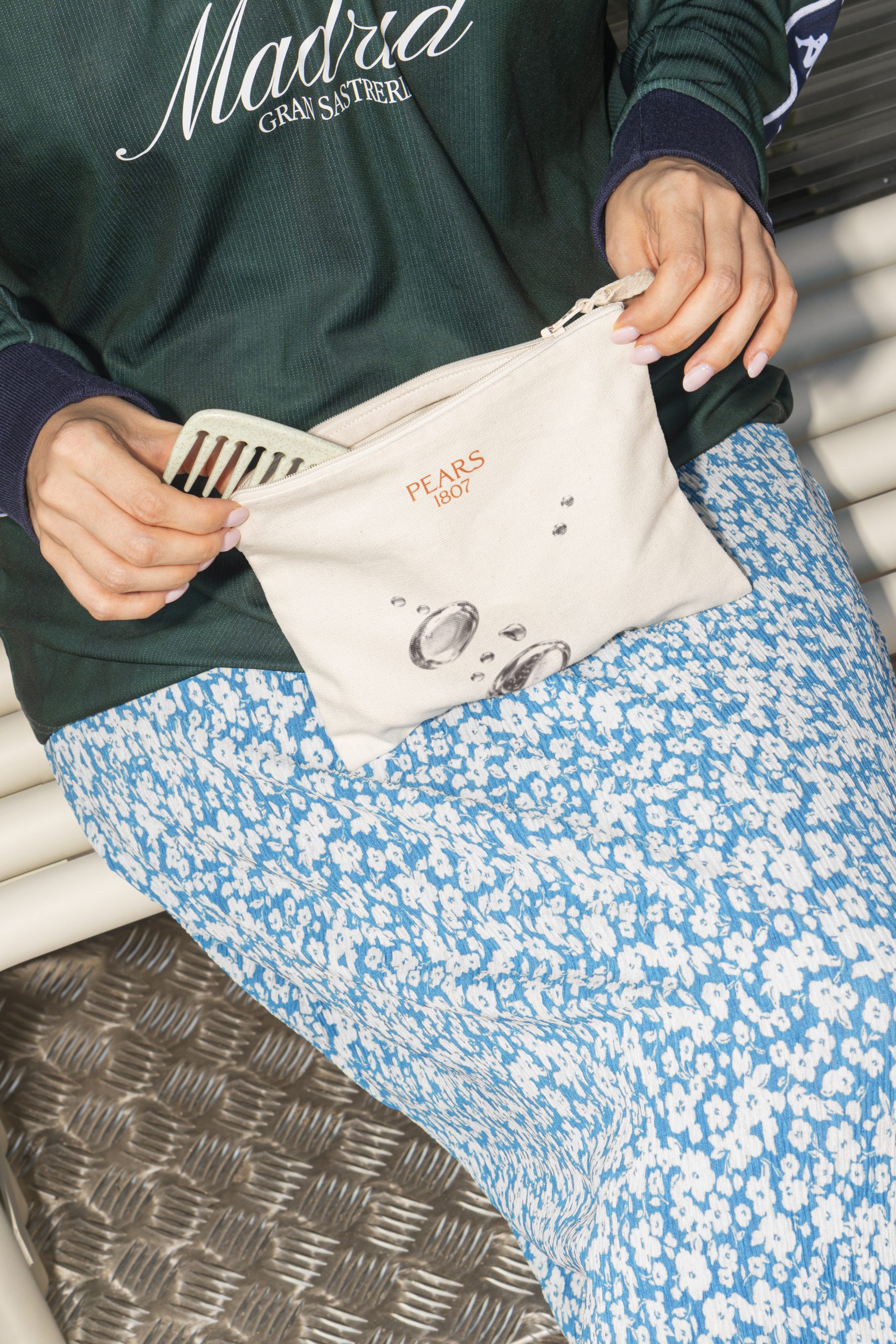
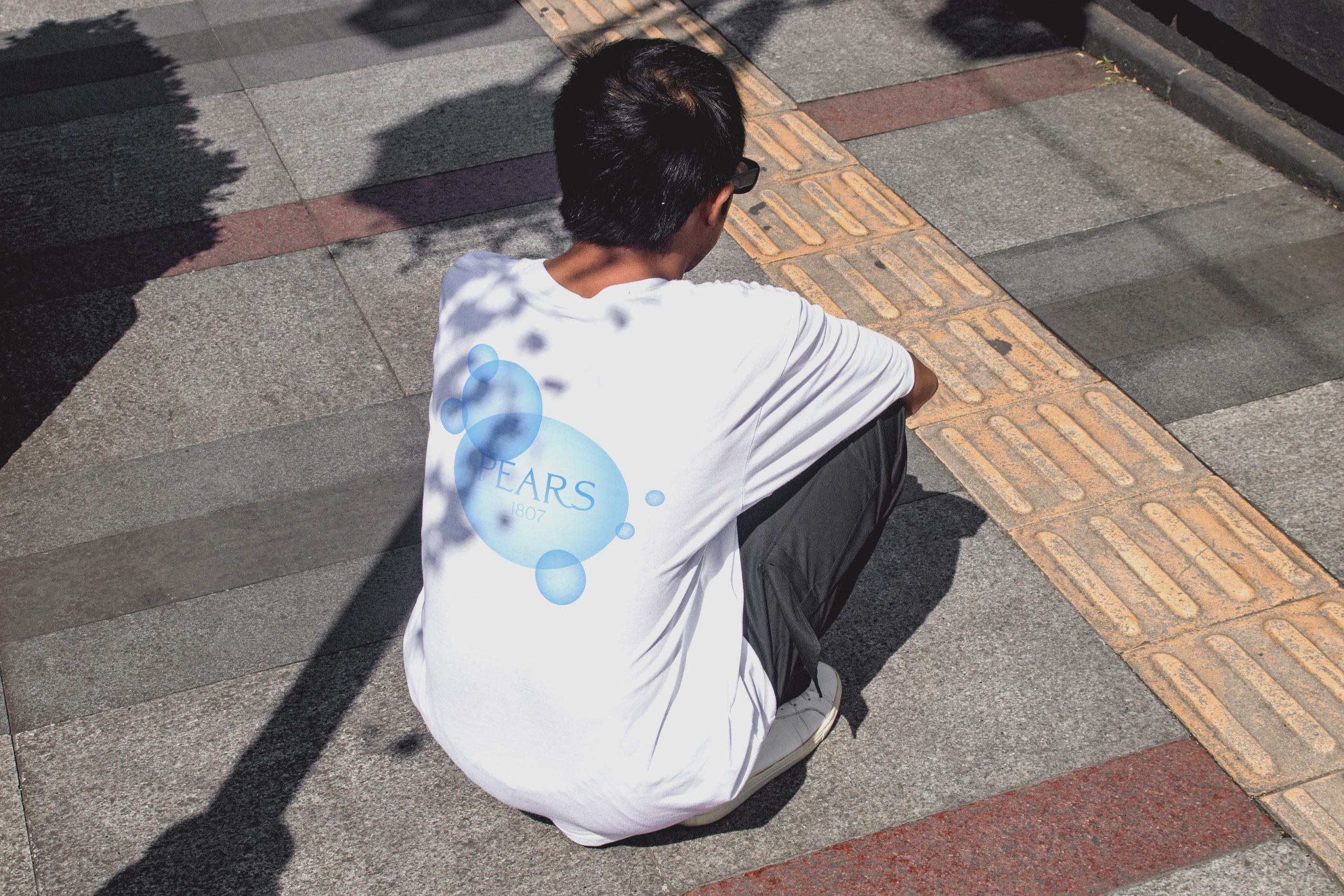
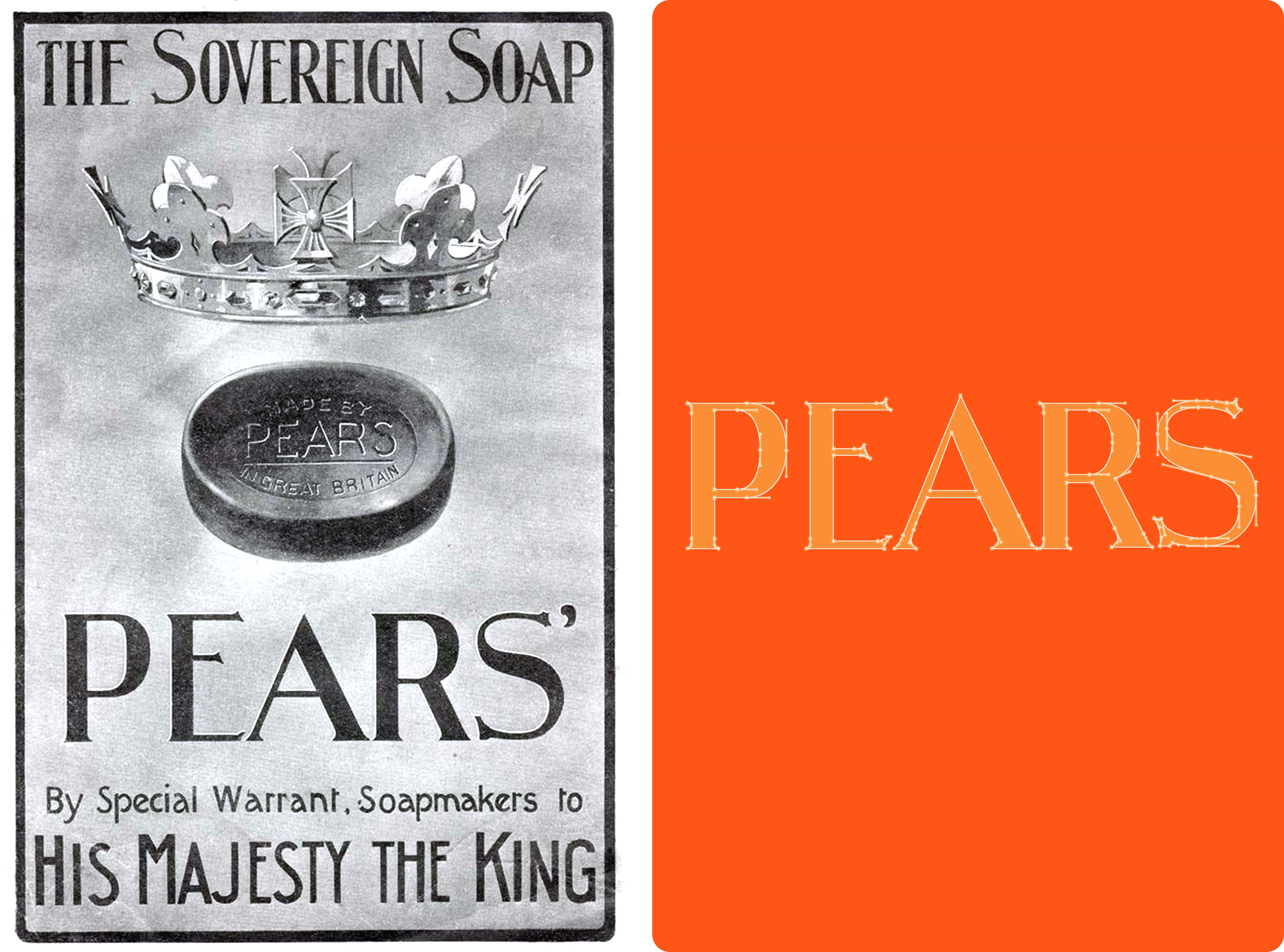
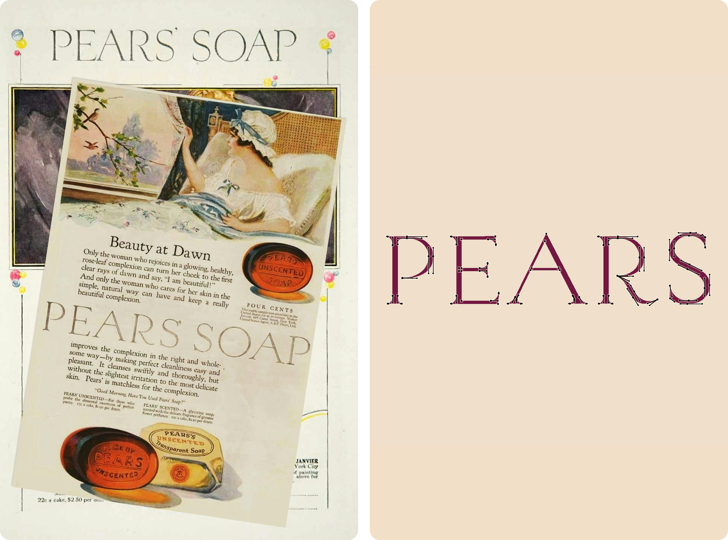
The design builds on the core values that have defined Pears for generations: purity, transparency and gentle care. These principles shape every aspect of the visual identity, from the clean typography and understated layouts to the product-first packaging.
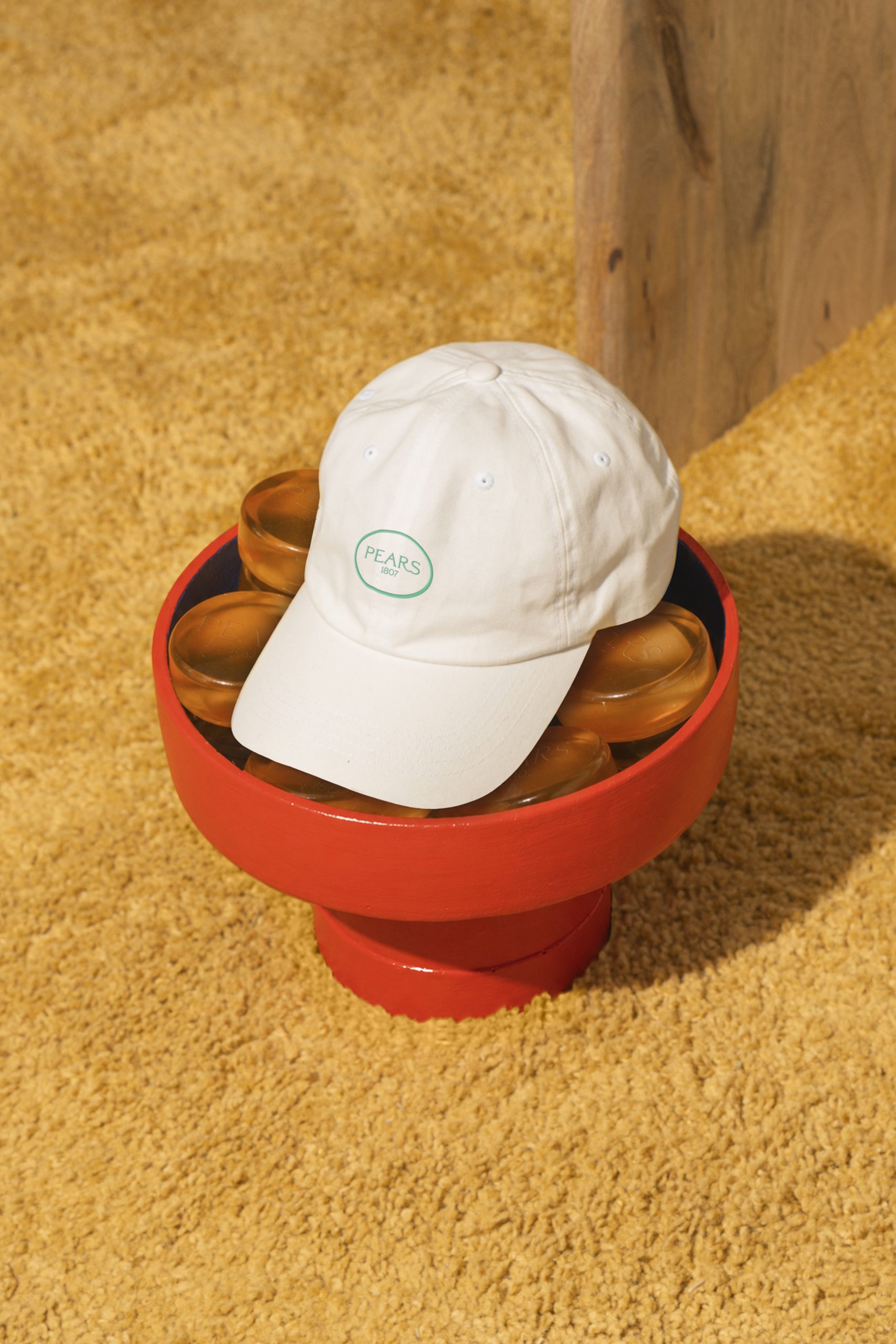
Editorial-inspired photography uses light, shadow and warm tones to reflect the clarity of the iconic glycerine soap, creating a visual language that feels both contemporary and rooted in Pear's heritage. The result is a brand that honours its heritage while presenting Pears in a more elevated and relevant way for today's audience.