Reading, England

Green Room

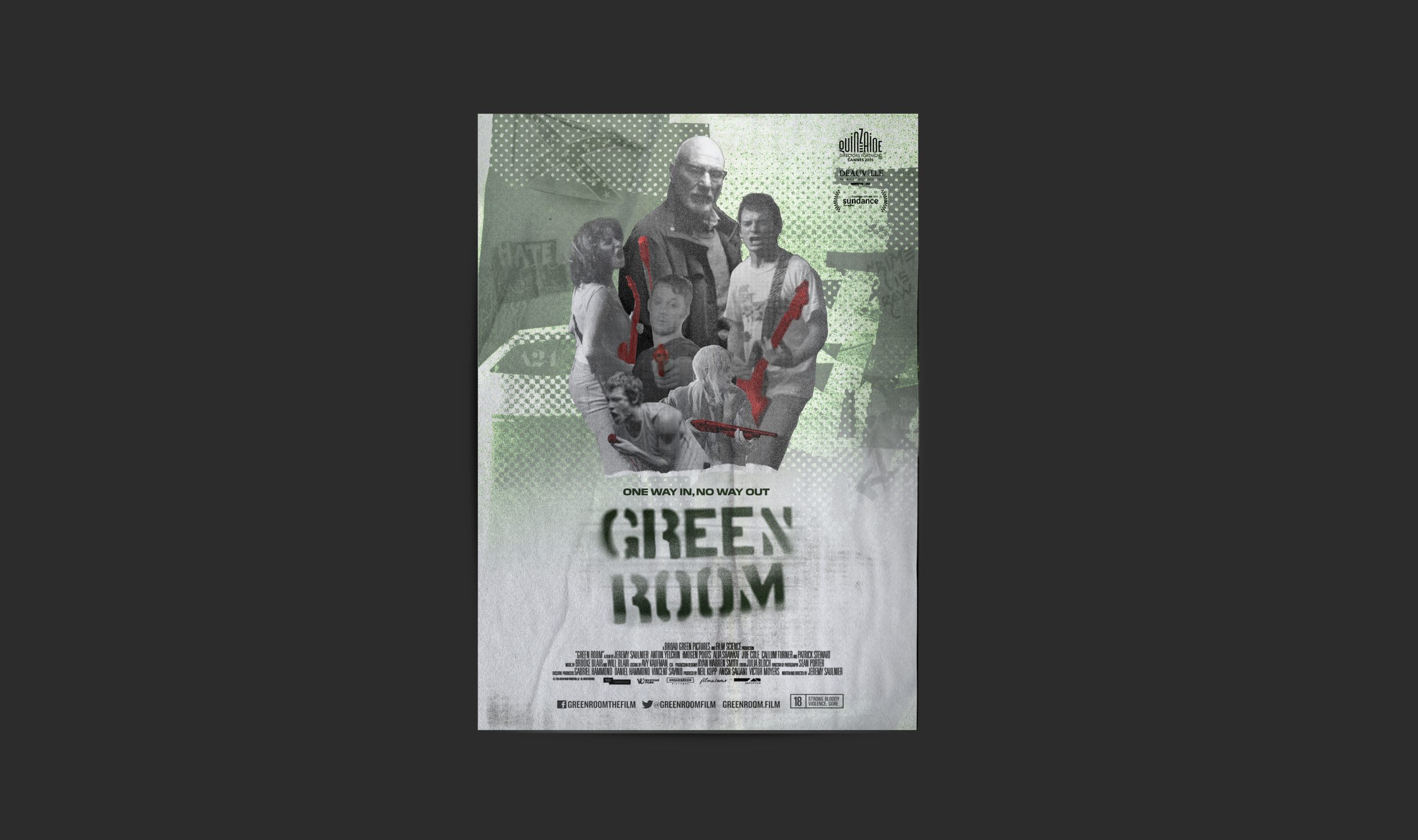
As a fan of Green Room, I set out to rethink its poster to better reflect the film’s tone and themes. The original artwork leans toward generic horror, suggesting a slasher or zombie narrative rather than the film’s true identity, and while it builds intrigue, it misrepresents the story and its characters.

This redesign instead centres on the underground music culture driving the narrative, drawing on DIY gig posters and punk aesthetics to capture the film’s raw energy and subcultural edge while preserving a sense of mystery.

Capturing the movie's tone

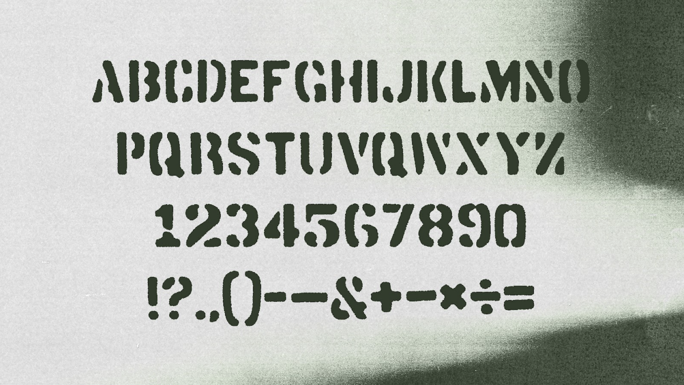
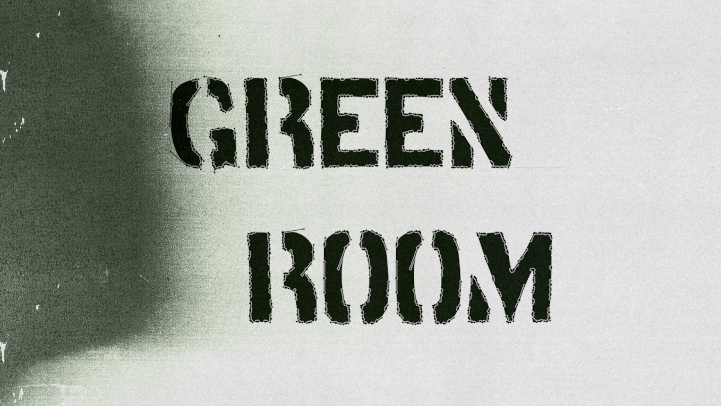
The first step was rethinking the title treatment. The existing logo felt closer to a superhero film, so I explored typography inspired by DIY punk culture, referencing stencilled band names commonly seen on guitar and amp cases. I also considered a Jamie Reid–inspired ransom-letter approach, but it conflicted with the stencil aesthetic. I developed a rough, pre-distressed stencil typeface designed to appear spray-painted.

Progress

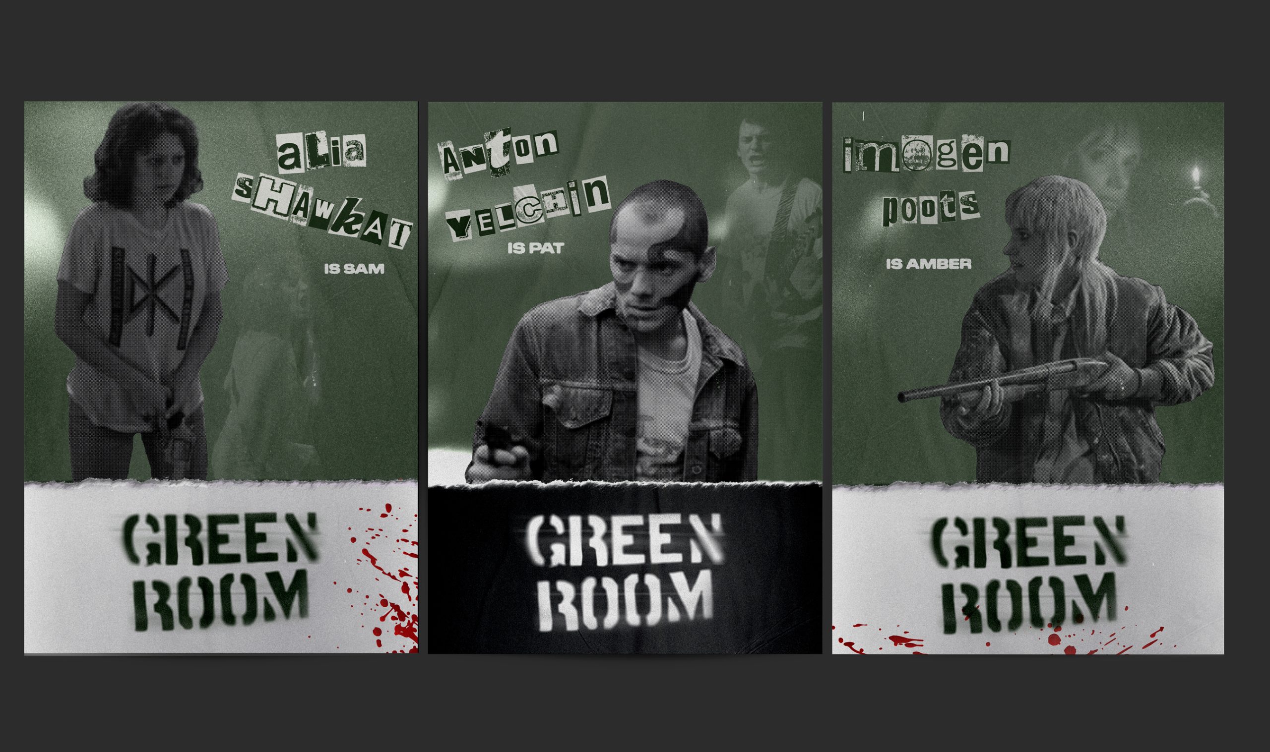
Several layout variations explored different typography and composition choices. Ultimately, the stencil typeface proved the strongest—visually bold and adaptable across marketing materials. In hindsight, the middle concept remains my favourite: cleaner, more focused, and more effective at framing the cast while hinting at the narrative.

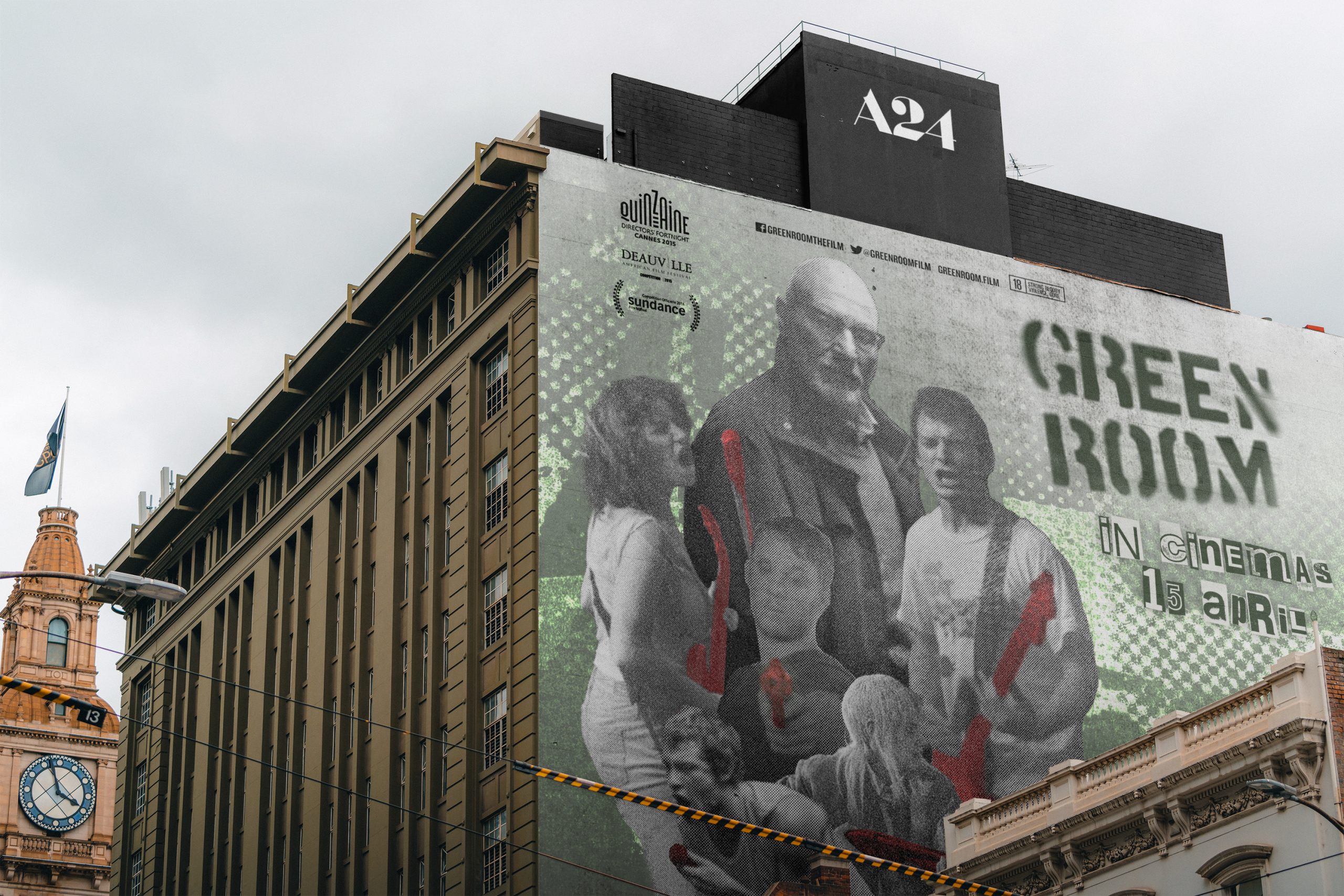
Out-of-home

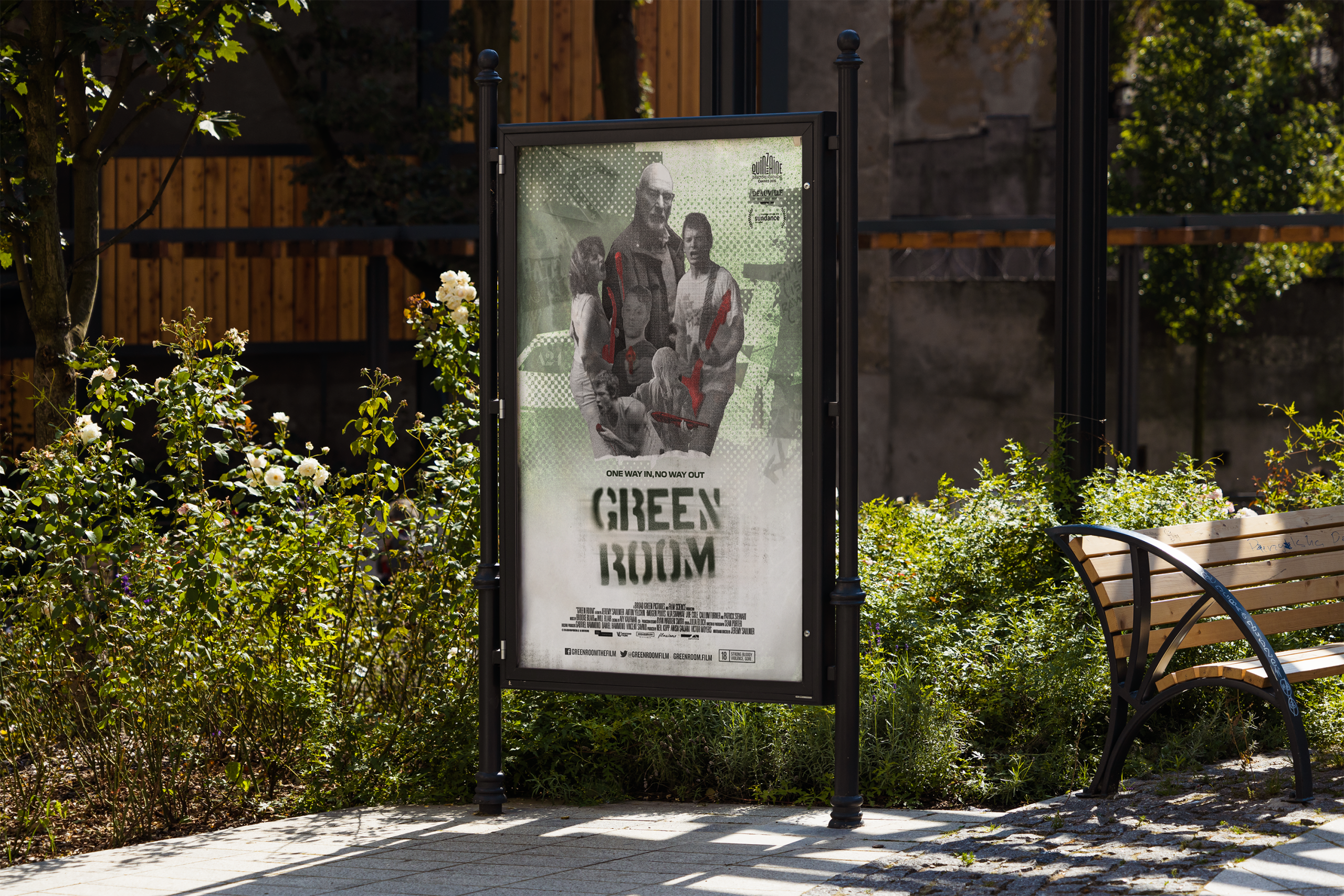
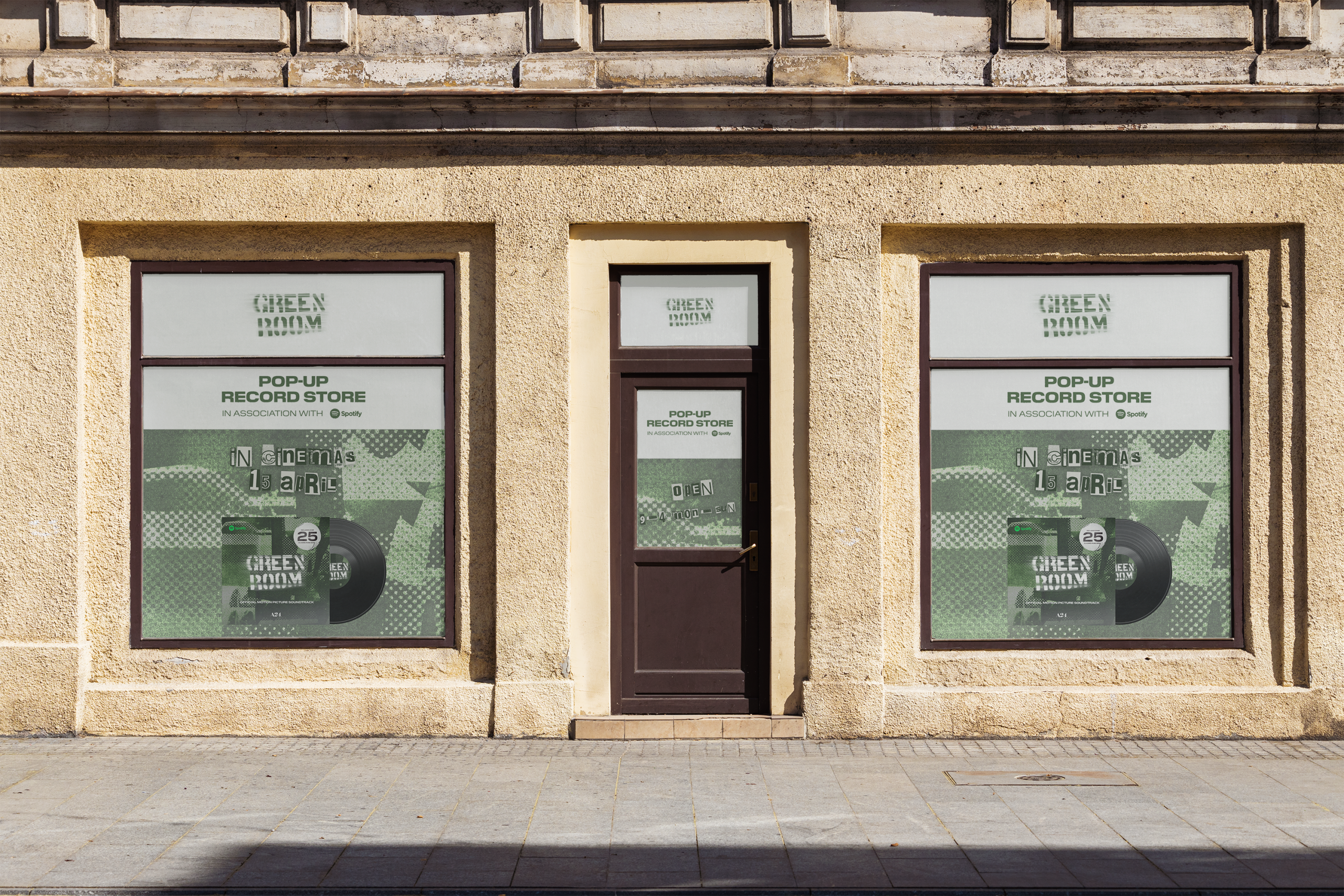
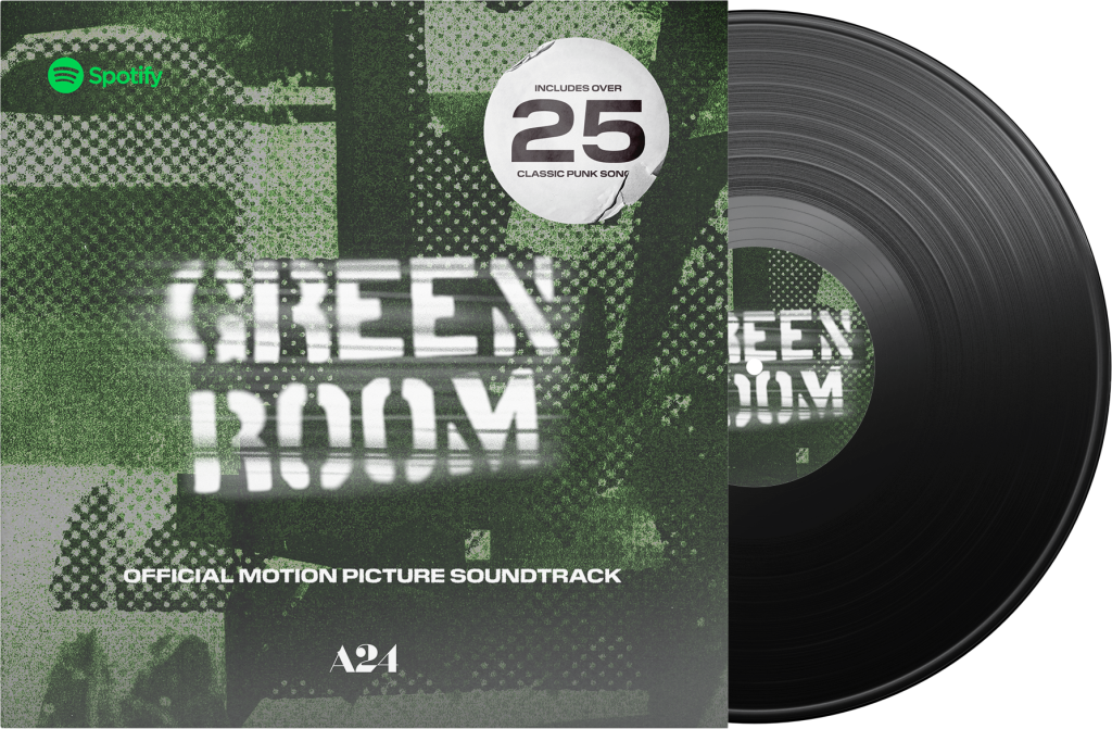
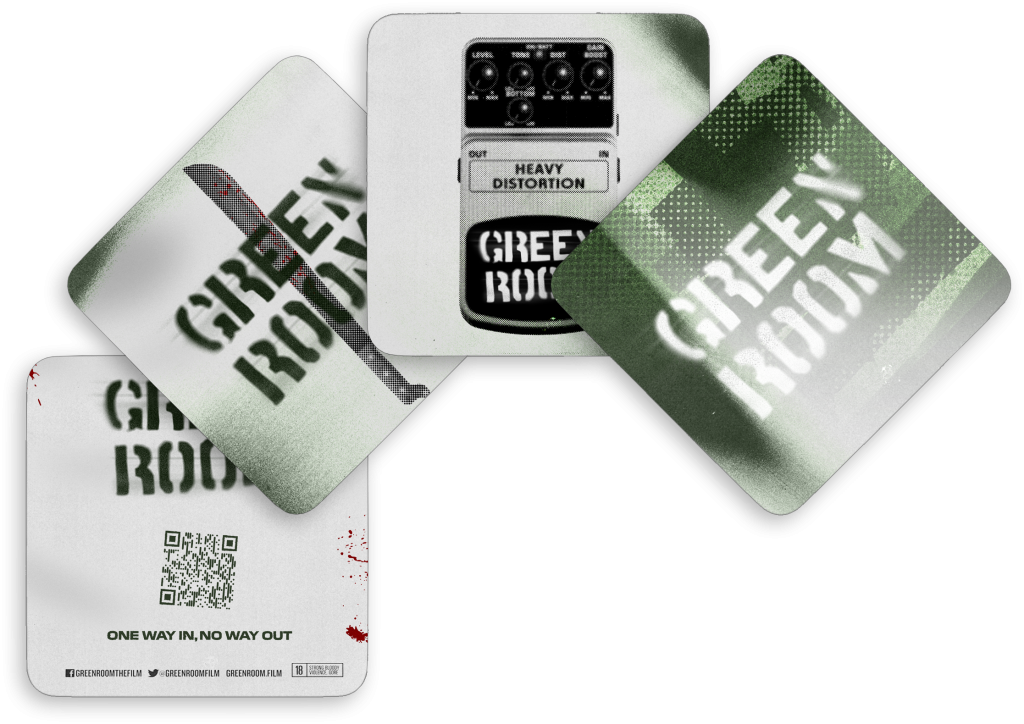
The visual system was designed to scale across out-of-home and digital placements. Inspired by the DIY ethos of punk culture, the design allows for variation in layout while maintaining consistency through colour, texture, and graphic language.

Marketing

Despite critical acclaim, Green Room grossed around $3 million against a $5 million budget, suggesting limited marketing reach. To expand visibility, I developed additional character-focused posters to attract fans of the cast, supported by a broader digital campaign across platforms.